DREAMLAMP
The preschool of your dreams where you will learn everyday life lessons
UX Project - Dreamlamp App

Role
Role
Role
UX Designer, UX Researcher
UX Designer, UX Researcher
Tools
Tools
Tools
Figma, FigJam, Google Suite, Adobe Illustrator
Figma, FigJam, Google Suite, Adobe Illustrator
Responsibilities
Responsibilities
Responsibilities
User Research, Identify Missing Flows, Refining Design, Prototyping
User Research, Identify Missing Flows, Refining Design, Prototyping
Team
Team
Team
1 Designer (Me), 1 Product Manager, 4 Engineers
1 Designer (Me), 1 Product Manager, 4 Engineers
Quick Summary
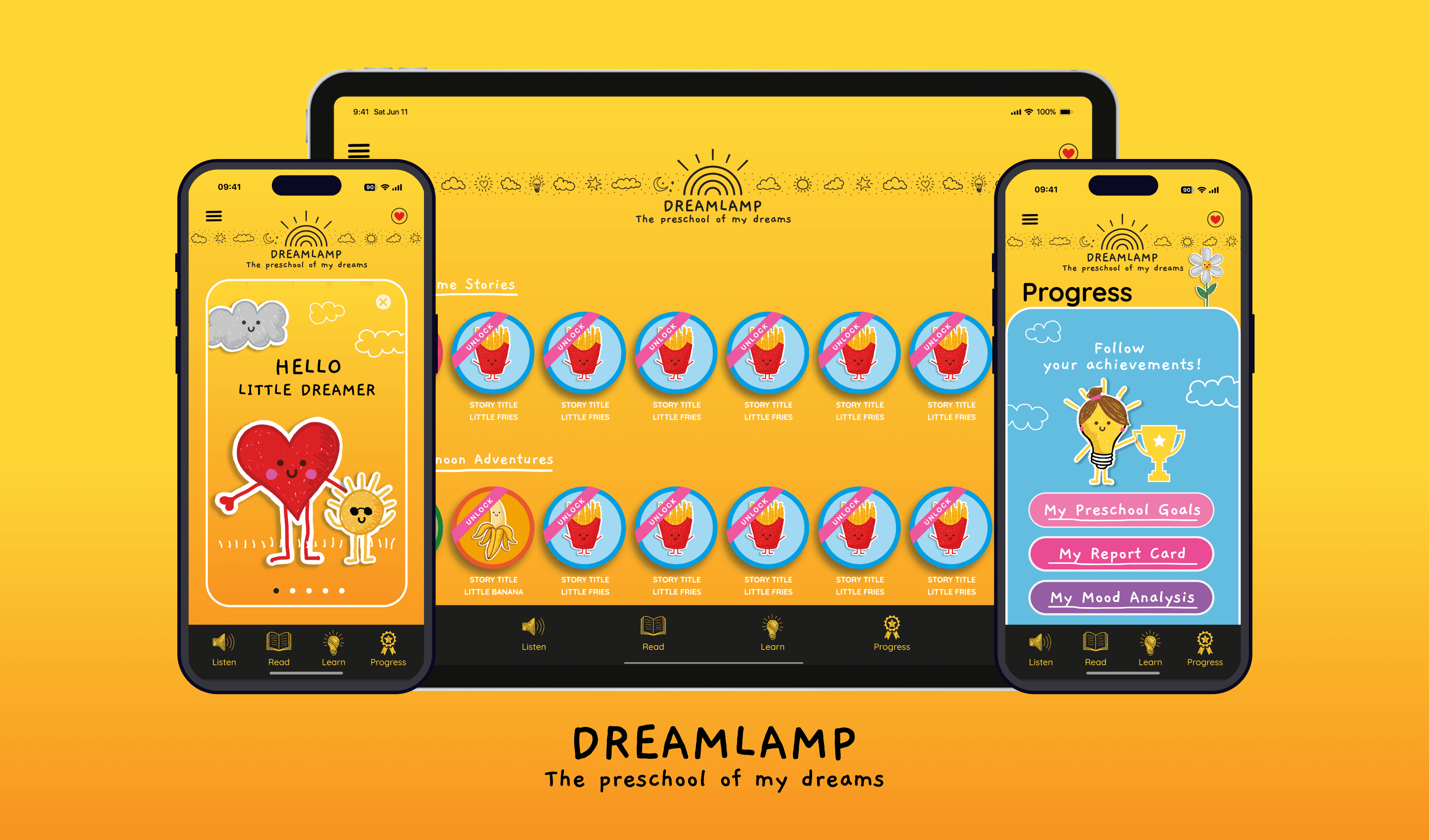
Dreamlamp is a children's learning app. It’s meant for toddlers and preschoolers. Where they get enriched with a learning experience that’s fun and engaging. We have audio stories, interactive books, and exercises for them to play and learn from.
My goal was to create a playful experience while collaborating with the stakeholders. With a vibrant theme and awesome characters that are hand-designed with purpose. I collaborated with a cross-functional team including a PM and 4 engineers.
We must place value in a preschooler's cerebral growth at an early age.
We must place value in a preschooler's cerebral growth at an early age.
Parents want to spend some quality time with their young ones. They want it to be a fun thing but at the same time want them to learn. And as studies show a person’s brain grows the most from ages 1-3 years. There lay an opportunity to have an experience that provides not only fun but learning as well.
The design inspirations I received were appealing but quite abstract. All the elements had fixed positions, which didn't align with functional design principles. My task was to take these inspirations and translate them into a cohesive app experience. I had to make sure that not only the experience is good but is also technically feasible. Expanding the user experience from a mobile screen to a tablet. Uzalitzing the negative space on the tablet screen was a significant challenge.
Parents want to spend some quality time with their young ones. They want it to be a fun thing but at the same time want them to learn. And as studies show a person’s brain grows the most from ages 1-3 years. There lay an opportunity to have an experience that provides not only fun but learning as well.
Create a cohesive user journey with an interactive experience
Create a cohesive user journey with an interactive experience
The goal was to create a fun and engaging experience for toddlers and preschoolers. As a starting point, we had some inspirational designs shared with us. My job was to identify the missing user flows. Alongside converting the inspiration designs into functional designs. To provide kids with a complete learning experience, we prioritized the following features:
The goal was to create a fun and engaging experience for toddlers and preschoolers. As a starting point, we had some inspirational designs shared with us. My job was to identify the missing user flows. Alongside converting the inspiration designs into functional designs. To provide kids with a complete learning experience, we prioritized the following features:
Mobile & Tablet App
Mobile & Tablet App
Small audio stories
Small audio stories
Small audio stories
Learning lessons/exercise
Learning lessons/exercise
Learning lessons/exercise
Time-based goals achieving
Time-based goals achieving
Daily mood tracking
Daily mood tracking
Daily mood tracking
Building without research but with the problem at heart. Acting as a conduit between the stakeholder and the team.
Building without research but with the problem at heart. Acting as a conduit between the stakeholder and the team.
The project had a limited budget and time. We did not have enough resources to do extensive research on the user personas. So we relied on the basics. With some baseline research and the stakeholder's vision. My challenge was to take it and make an experience out of it. The inspirational designs shared with us helped a lot in building an understanding.
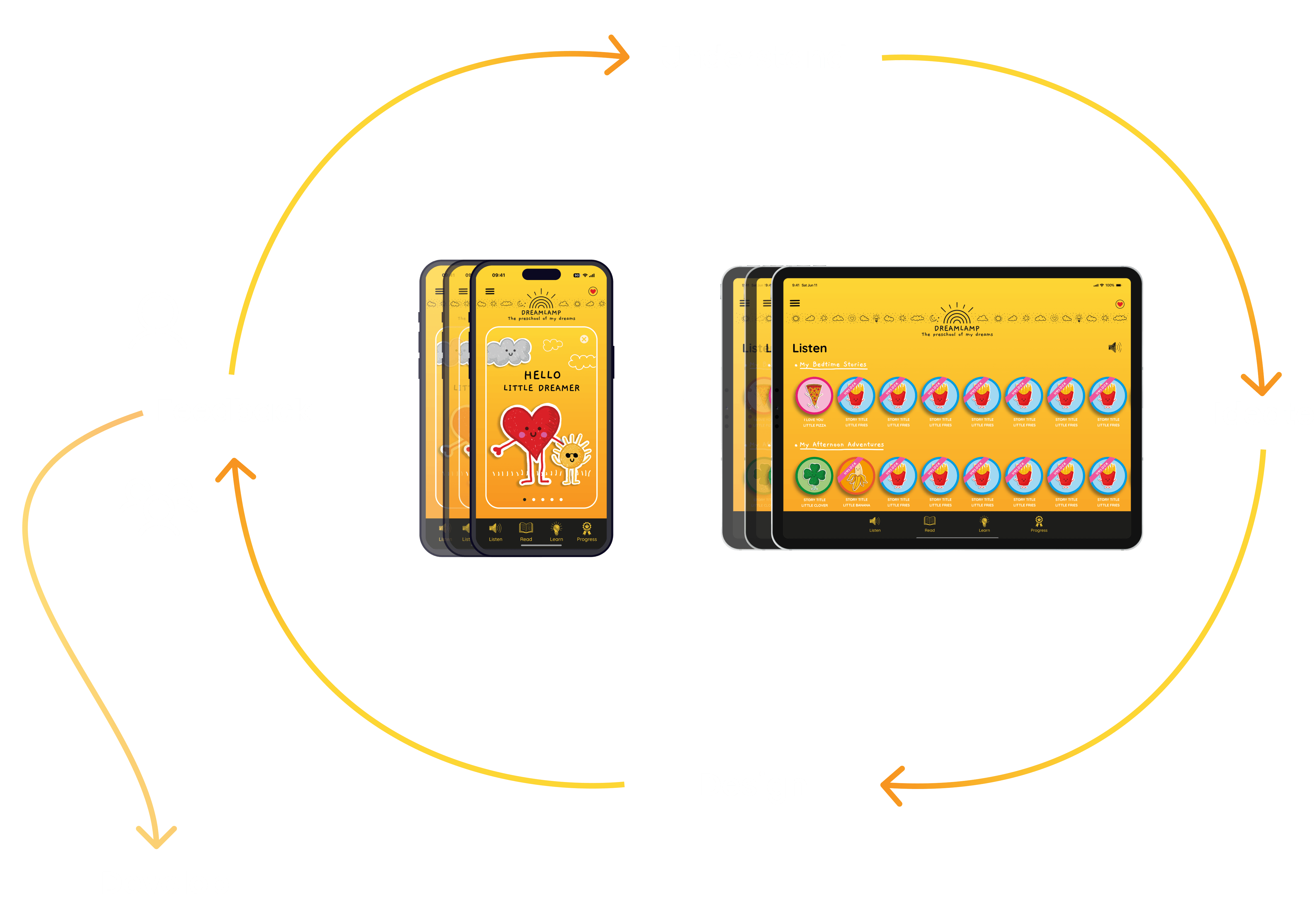
Alongside my design efforts. I collaborated with my team. And aligned them with the stakeholder's feedback, UI interactions, and product quality.
An immersive and interactive experience enhances cognitive, motor, and social skills.
Children are reactive and have short attention spans. So the app needed to be engaging to capture their attention. With my baseline research, the three main insights were that an app for toddlers should have:
A simple and intuitive interface that young children can navigate and learn.
Provide learning in areas such as letters, numbers, shapes, colors, and basic problem-solving.
Interactive features like music, sound effects, and animations. Making the learning experience more fun and engaging.
Building without research but with the problem at heart. Acting as a conduit between the stakeholder and the team.
The project had a limited budget and time. We did not have enough resources to do extensive research on the user personas. So we relied on the basics. With some baseline research and the stakeholder's vision. My challenge was to take it and make an experience out of it. The inspirational designs shared with us helped a lot in building an understanding.

Alongside my design efforts. I collaborated with my team. And aligned them with the stakeholder's feedback, UI interactions, and product quality.
An immersive and interactive experience enhances cognitive, motor, and social skills.
Children are reactive and have short attention spans. So the app needed to be engaging to capture their attention. With my baseline research, the three main insights were that an app for toddlers should have:
A simple and intuitive interface that young children can navigate and learn.
Provide learning in areas such as letters, numbers, shapes, colors, and basic problem-solving.
Interactive features like music, sound effects, and animations. Making the learning experience more fun and engaging.
Wiring user flows to identify gaps and complete the user journey
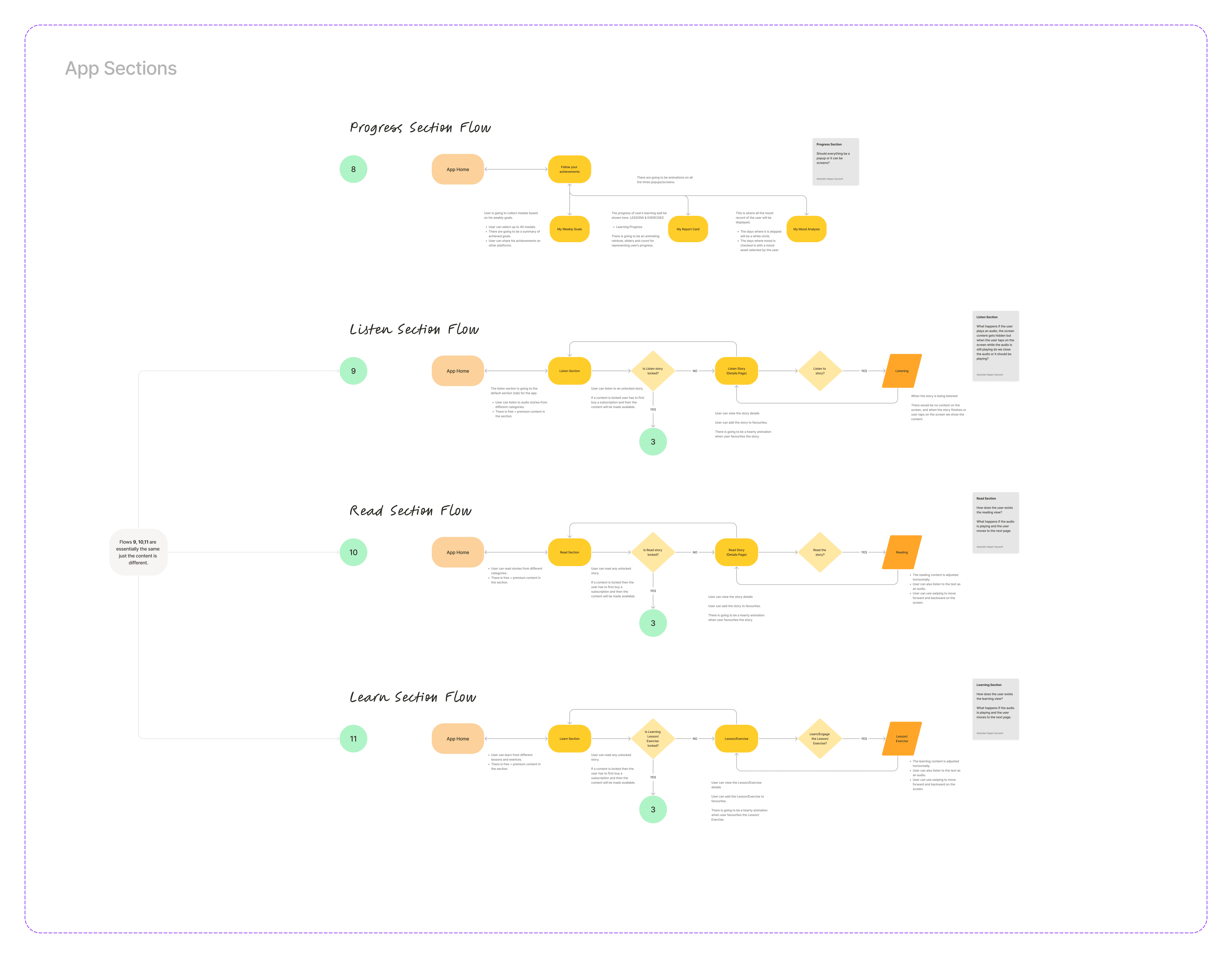
I mapped out the user journey through user flows. Helping us to level out all the key features of the app. While doing so, I also identified the missing gaps in the user flows. And connected the dots to complete the user journey.
I mapped out the user journey through user flows. Helping us to level out all the key features of the app. While doing so, I also identified the missing gaps in the user flows. And connected the dots to complete the user journey.

I also did a small comparative analysis to see what key features are synonyms in all kid's apps. The insight from this was that the audio stories are going to be one of the key features for us as well.
I also did a small comparative analysis to see what key features are synonyms in all kid's apps. The insight from this was that the audio stories are going to be one of the key features for us as well.
Connecting all the dots in the user journey helped to build a cohesive user experience.
Next, I focused on the inspiration designs given to me. An interesting note here is that the stakeholder himself was; creative. He worked on the inspirational designs himself. So it was very personal to him. His designs had all elements positioned absolutely on the screen. It looked great but the designs violated the functional design principles.
So I took the inspiration and translated the design into functional ones. And upon many feedback cycles, I was able to complete the designs for one key user flow. I prioritized the mobile version of the app first.
A responsive user experience is more than a consistent UI and a single layout
Using the mobile designs as a reference. I designed the experience for the tablet version. But the tablet version had a lot of white space making the experience feel empty. So I did a design analysis and came up with a system of 3 columns. In this system, we always have 3 columns, but on mobile, we only show the middle column. And as soon as the device type changes to tablet, two columns appear from the side. This system made sure that all interactions were present in the center column in both the device types. Making the experience consistent and learnable.
Using the mobile designs as a reference. I designed the experience for the tablet version. But the tablet version had a lot of white space making the experience feel empty. So I did a design analysis and came up with a system of 3 columns. In this system, we always have 3 columns, but on mobile, we only show the middle column. And as soon as the device type changes to tablet, two columns appear from the side. This system made sure that all interactions were present in the center column in both the device types. Making the experience consistent and learnable.
Audio engages more than visuals. The power of random testing.
As we did not have the budget to do user testing. I was still curious to test the developed MVP app. So I took the app in the development phase. And tested it with a few preschoolers in my circle. Some of my observations:
Screens with voices were more intriguing than ones with static visuals.
The screen with both voice and visuals had a higher engagement time than the rest.
These were interesting insights. Sharing this with the stakeholders helped him to see the value of testing and research. An update made against this was that we added audio on many screens.
Design is not about form only, it’s more about function. And functional designs are the ones that not only work but provide a cohesive experience .
Working on this learning app for children was pretty exciting. I not only understood more about functional designs. But also on responsive designing. Alongside my design efforts, I helped the team with clarity on stakeholder feedback. My engineering background helped in collaborative problem-solving. Involving engineers from the start helped with ideating more solutions. Because of this, I was not only able to design a good experience but received awesome feedback from the team.
Working on this learning app for children was pretty exciting. I not only understood more about functional designs. But also on responsive designing. Alongside my design efforts, I helped the team with clarity on stakeholder feedback. My engineering background helped in collaborative problem-solving. Involving engineers from the start helped with ideating more solutions. Because of this, I was not only able to design a good experience but received awesome feedback from the team.
Learnings
The project allowed me to see the cross between functional & responsive design. Enabled me to see that, aesthetics while important are not always workable. Helped me to understand the value of involving the engineering team in the early phase of ideation.
The project allowed me to see the cross between functional & responsive design. Enabled me to see that, aesthetics while important are not always workable. Helped me to understand the value of involving the engineering team in the early phase of ideation.
Understanding more about functional designs.
Value of considering engineering perspective early in designs.
Advanced component design and use of auto layout for improved design efficiency.
Learning new interaction details, enhancing Figma prototyping skills.
Understanding more about functional designs.
Value of considering engineering perspective early in designs.
Advanced component design and use of auto layout for improved design efficiency.
Learning new interaction details, enhancing Figma prototyping skills.
THE END
Thankyou 🙏🏻
I appreciate your time and attention, I hope you have liked the work. Want to share your thoughts?
I appreciate your time and attention, I hope you have liked the work.
Want to share your thoughts?
I appreciate your time and attention, I hope you have liked the work. Want to share your thoughts?


